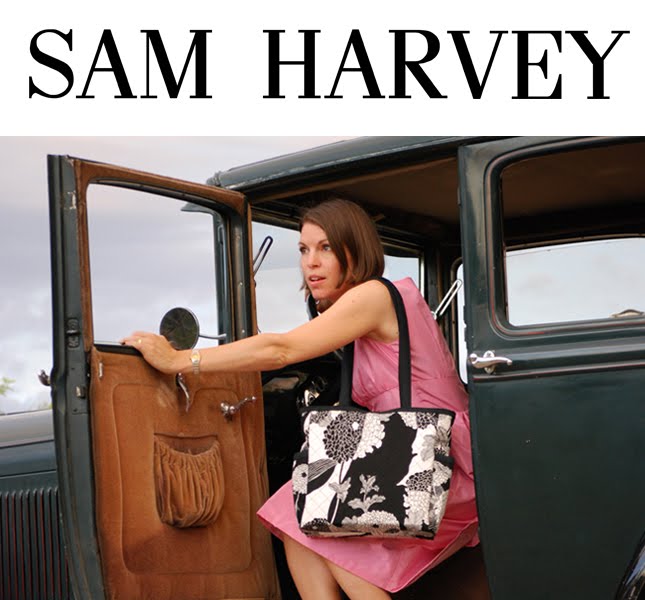
Hi there! I am blessed to have such a cool virtual design team. So far I have some great feedback about the logo and font. I feel some element of cheese setting in after talking to Sherrie. Sherri works at H & R Sales and she is bag collector. I don't mean collecting cute bags like should I say Coach or Dooney. I am talking Ferragamo. This woman knows her stuff. I agree when she says "What the hell does a panther have to do with SAM HARVEY!"
She wants to know who Sam Harvey is... I do have my Zaida's photo. This photo of Harvey was taken in the 40's and he does embody what this name stands for. Harvey, a Canadian, became a US citizen in 1946. Harvey, his wife Racille and their children Robert (my dad), Greg and Rita lived in the suburbish area known as Culver City, near the sprawling MGM Studios which fascinated the family on Sunday drives. Harvey’s first job was that of a meat cutter and he worked for King Cole markets, beginning a career as a butcher that would last six or so years until he began pioneering barbeque concessions in major supermarkets, specializing in chicken and ribs to take home. Harvey had a unique friendly manner and a knack for publicity which frequently resulted in his appearing in the papers.
Sam Harvey stands for vintage style with a modern edge, traveling to new places, hiking the Grand Canyon rim to rim in a day, playing the net in tennis, putting it all out there, following your dreams, going on a jeep trip for a year around the world and having style while you are doing it. That's what I am talking about.
This is my Zaidi, Harvey Nep
I feel like yesterday I was piling again. Doing too much. Making this more than it needs to be. What do you think? I don't want to have bags with cheesy logos all over it. What would the Harv do. He would wrap it in bacon. I love his vintage tie here. I must dup this tie.


4 comments:
This is what I'm talking about! Like I said when I first heard the name SAM HARVEY, the name feels right, it feels substantial, friendly, dependable, adventuresome, retro and yet modern. I love the tie too. Work it!!
Love you Sherrie! I will do some thinking about the font for sure! I will look at making the font a little similar but more unique.
Love the name, like the brand direction, but still like the original treatment best. The first logo read to me like SAM Harvey. Pow. It made a statement (amazing what a little font variation can do).
I'd be tempted to change 'so take it' to simply 'take it' or even 'take it with you'.
This treatment seems to me to be understated. Almost timid.
You can have multiple treatments of the logo - name and logo together, name alone, logo alone. Our logos (both Tin Cactus and Studio F1) were designed to stand alone or with the name.
The vast majority of logos are just custom treatments of fonts - think Bed, Bath and Beyond, time, sony, ebay, google.
My 2 cents, for what it's worth
Craig,
Once again, great comments. I am going to put on my nerdery hat and play with the font in Autocad to make it a little more unique. To me the tips of the letters are a little token. I will post some mo! You are great!
Lara
Post a Comment